| ARTWORK TIPS: Helpful hints on preparing your files for print | |||
| Everyday we receive so many files for print, most of which can be printed without any problems. Occasionally though we get files which do not print as intended or not as the customer expects. This page is here to help explain the terminology used, as well as guide you through the stages of designing and setting up for your artwork files before print to help avoid costly mistakes and reprints due to incorrectly supplied artwork.
For an image to print properly, the image resolution must be at least 300 dots per inch (DPI) at the final output size.
You need to start and create your file at 300dpi from the beginning. If your file is not 300 dpi or has been taken off the internet, you can not increase the resolution of the image to a higher one by increasing the DPI in your imaging program. The printed result will be a blurry image.
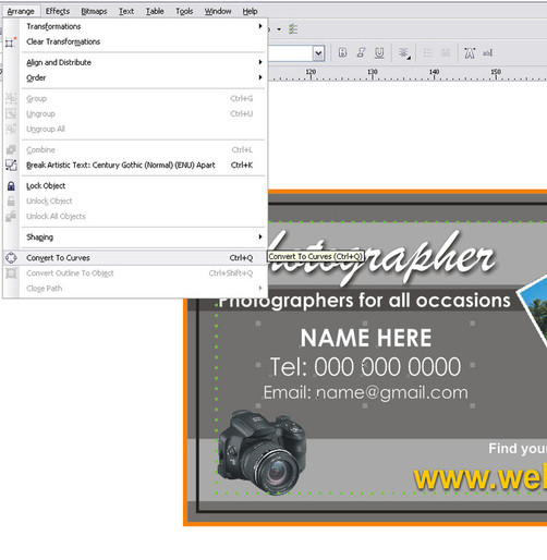
If working in Corel Draw or Adobe Illustrator, the actual file will be a vector image so you will not need to worry about the resolution unless using images/photos. For this the images need to be a minimum of 300dpi (as above)
COLOUR MODE Your scanner, digital camera and monitor use a combination of three colours: Red, Green and Blue (RGB) to view and create images. The printing process uses four colours to print the same images: Cyan (light blue), Magenta (cerise), Yellow and Black (key colour), commonly referred to as CMYK or Full Colour. The conversion of images and files from RGB to CMYK should be done before the file is sent to us in an image manipulation package like Photoshop or Corel Draw. If this conversion is not done there is a danger that a colour shift may result in making some of the colours appear to be washed out or dull. If unsure, it is always best to set your file up in CMYK from the start to ensure the colours are as you wanted.
This is one of the many resons we do not accept files from Microsoft Word, Powerpoint or excel. These programs create files in an RGB format with bright screen colours which may change when printed.
PANTONE SPOT COLOURS Pantone Colours or Spot colours are used on custom print jobs where exact colour matching is required. Pantone has produced a set of coloured inks which are used the world over by design agencies and printers, ensuring that corporate companies always have the same colour used on all their printing. Pantones or Spot colours is where the actual ink is mixed before print from a carefully selected breakdown of pigments, and is then put onto the the machine and printed. This is used in the methods of screen printing and custom litho print jobs. Full Colour is where the image or print is made up of tiny dots of CMYK inks (as above) and when laid on top of each other at different angles, create a colour image. All our litho printed products on our price list are printed in full colour (as above) and do not include Pantones or Spot Colours. Any artwork supplied with Pantones or Spot colours will be converted to CMYK upon print, which may change the colours somewhat.
BLEED It is very important to include bleed on all artwork where there is an image/background that will print to the edge of the cutting border. Add 2mm to each side to allow for cutting. For example, a 90mm x 50mm Business Card with full bleed, the image size should be submitted at 94mm x 54mm.
| |||
RGB
Standards for Red, Green, Blue; the primary colors for visible light.
RGB depends on a light source to create color. Your monitor, for example, creates color by emitting light through red, green, and blue phosphors.
RGB color mode is best for your monitor but not for paper. RGB will not separate for production.
CMYK
Stands for Cyan, Magenta, Yellow, and Black; the colors used in four color process printing. CMYK is based on the light absorbing quality of ink printed on paper. Please make sure that all photos / pictures are saved as CMYK.
Color Shifts
Be sure to convert all RGB images to CMYK before submitting to avoid color shift. A Color Shift occurs when converting from RGB to CMYK.


